
I don’t know about you, but few things hit my taste buds harder than old, stale coffee. You know, when that cup is sitting there, you’ve been working hard and take a swig. It’s at that moment you realize it’s been sitting there for a couple of hours and just plasters your taste buds with bitterness and disgust.
When you realize it, it’s too late, we have to swallow it, but you then get up and go get something else to drink to get the taste out of your mouth.
That’s not a dissimilar reaction that consumers get when they find a website that is dull or outdated. The page loads, but in an instant, they close it out and look for something else. You know how it is today. Patience is NOT a virtue among the buying public. Everything has to be an immediate satisfaction to them or chances are, they move on.
What does your website say to a new visitor? Is it visually appealing? Is it mobile responsive? Does it make clear what your company provides as a service or product? In the time it took you to read the previous sentence, your new visitor has decided to stay and continue to explore your site, or they’ve moved on, probably forever.
Here are a few tips to help retain that visitor and generate more business with your website.
Make sure your website is visually appealing
Remember your website is the first impression for most of your new customers. New customers are the lifeblood to a growing business. One of the best examples of the value of a first impression are the commercials for the “Big game” that we all have parties for. Many just attend for the interactions with family and friends, and watching for the commercials.
Which ones made a good impression? Which one flopped? Which one was really funny or cute, but you can’t recall what they sell or provide? Now, you’re not spending millions on your website, but the approach is the same.
Catch their attention, keep them interested, and promote yourself correctly so they remember you.
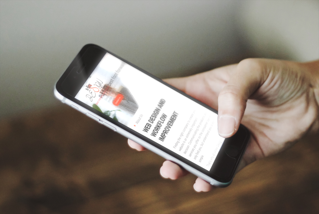
Mobile responsive is a must
Still today, I see websites made 6, 8, 10+ years ago that at the time were great. Website are NOT wine. They don’t get better with age. According to Statista, and other sites, mobile search engine visits account for over 60% of all searches, up over 40% from just 10 years ago. That is a trend that I don’t see falling backwards.
Mobile experience is vital to a consumer staying on your site, and engaging with you for business. If they like what they see, chances are they will also visit your desktop site, but first impressions are lasting impressions. Compare your sites mobile experience to 3 competitors in your area.
It’s not just finding a site on mobile that should get your attention, but understand that over 54% of ALL e-commerce purchases, happen from a mobile device.
Call to Action
What does a CTA or Call to Action mean? It means are you asking your visitor (figuratively) to do business with you?
I remember when I started in sales, the catch phrase was “Always ask for the check”. A CTA is basically providing that function on your website. If you’ve captured your visitor with great visual appeal, they know what you provide and they have stuck around long enough to see your content, you MUST make it easy for them to contact you.
A single phone number or email stuck in the back of your site will not do it. You need easy access buttons that call you directly, email you directly, or launch your contact form so your visitor can connect you with with the least amount of clicks, touches or navigations possible.
There is more!
This is just the beginning of what needs reviewed. The important thing is to get started, so connect with us, and we can evaluate your site, provide direct feedback on proposed changes, or simply validate that it looks good!
Either way, let uViewDesign make sure you’re ready for every new visitor you find!